5 Hidden Features in iOS7
Here are 5 hidden features in iOS7 that you didn't even know you needed, but now won't live without:
1. You can close multiple apps at once
You probably already know that double tapping the home button will give you a preview of your app window, and that swiping up will close an open task. But did you know you that you can swipe two or more windows up at the same time? Try it!
2. Smart App Updating
Gone are the days of staring at that Update badge steadily climbing as you wait for a wi-fi connection to "Update All."  Apple knows you live a busy life and took all of the work out of maintaining your apps up-to-date. Turn on "Background App Refresh" and sit back and let your phone update itself. Fair warning though, this will lock you out of your app without notice - so if you are about to give a presentation and need your notes, be sure to turn off this option so you don't get caught off guard.
3. Time stamps on messages
In addition to conversation time stamps, you can now just swipe from
left to right to see exactly when each message comes in or goes out.

4. Audio-only FaceTime Calls
You don't have to burn through minutes if you're talking to another iOS user. Just go to Facetime and choose the phone instead of the video icon and make crisp audio-only calls.
![]()
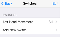
5. Motion Sensing Controls
Need to launch Siri but have your hands full? Now you can use your iPhone's motion sensing capabilities to complete tasks with a tilt of your head. Pretty awesome.